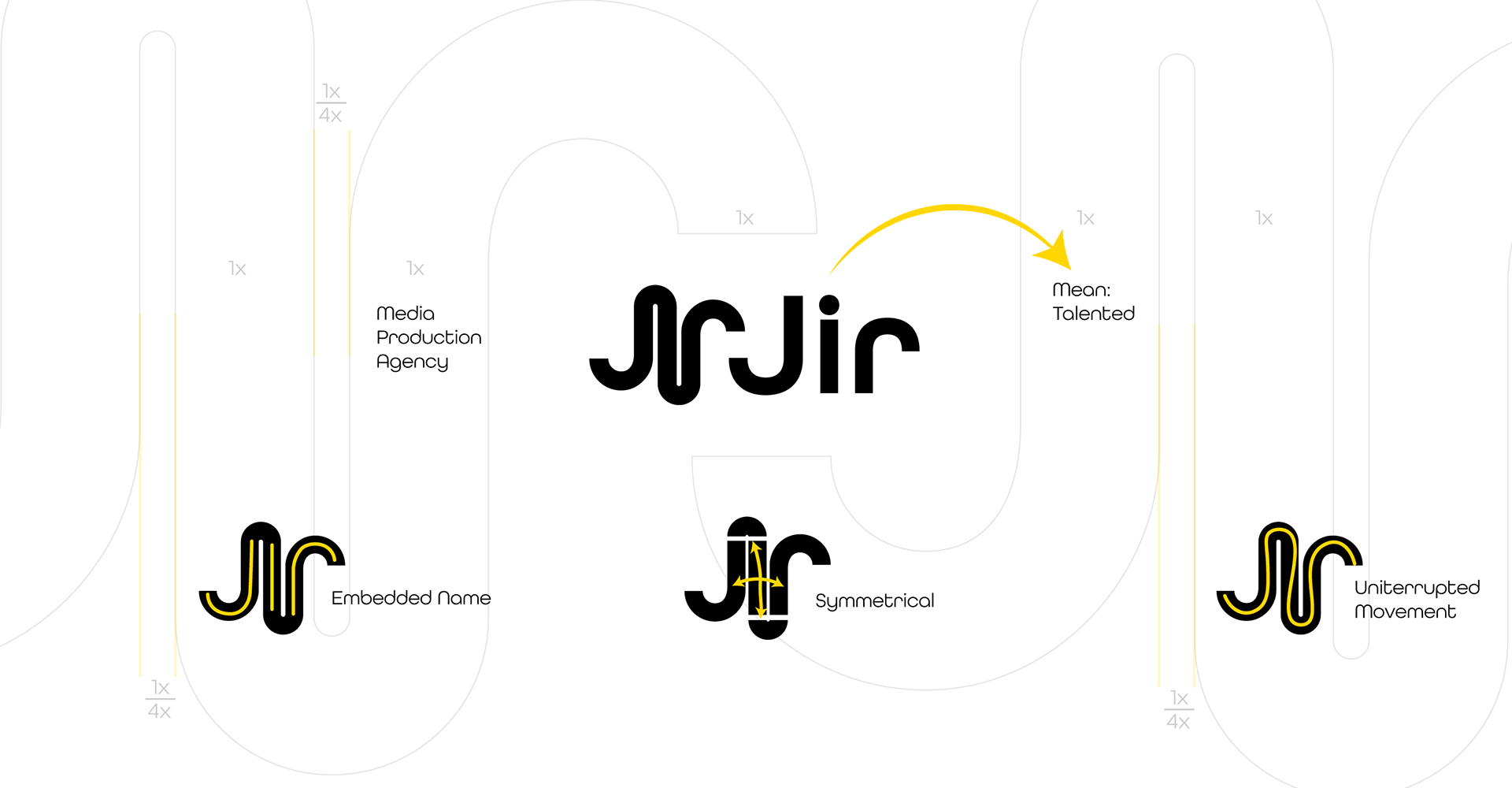
Jir, which literally means "talented-intelligent", has the capacity to manoeuvre with its flexible and innovative structure. This name, while trying to emphasise the talents of an agency, its logo also symbolises this work. It tries to show its clear and determined stance with its sharp beginnings and endings; It also tries to show its flexible and flexible side with its round turns.
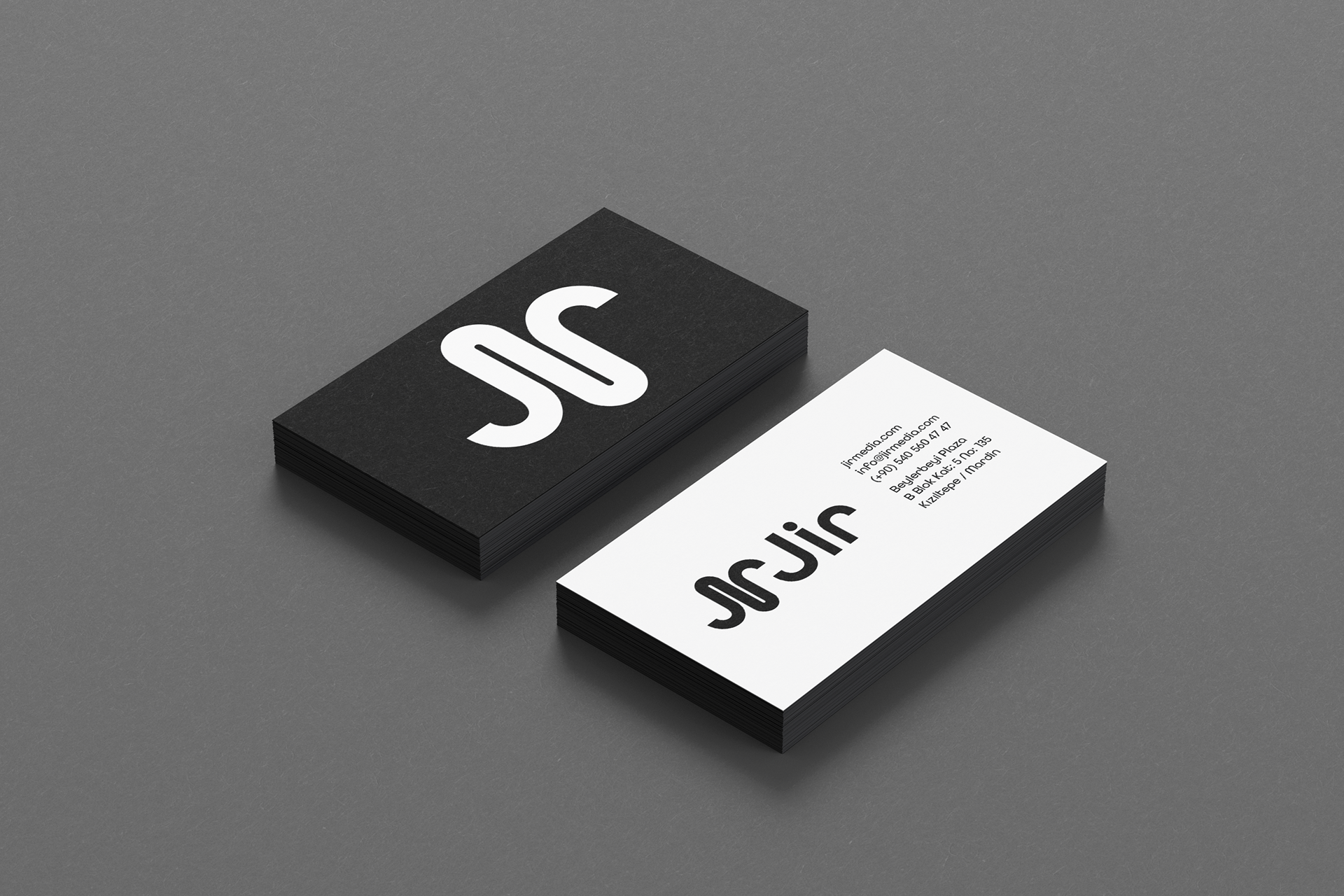
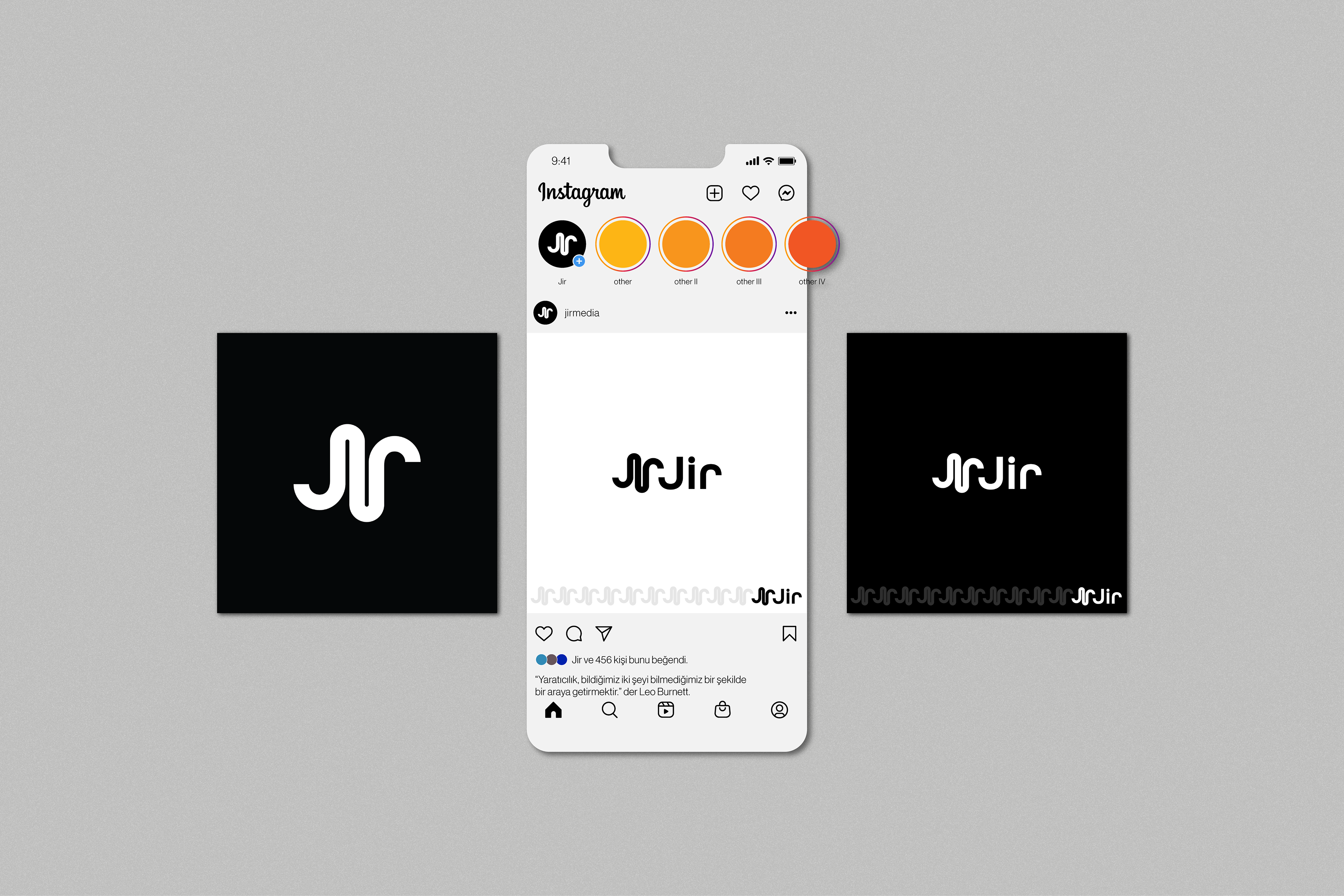
"Jir" is embedded letter by letter exactly in this logo. By staying true to this structure, the font that will give the same feeling and weight has been determined as All Round Gothic. Since it is an advertising and media agency, its interted corporate colours will always remain valid in black and white, timelessly and without space.