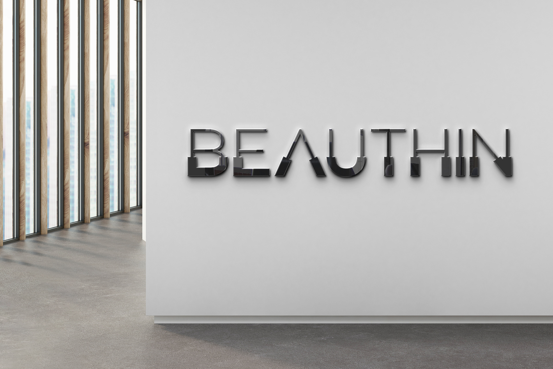
BEAUTY + THIN
As a brand name consisting of the words "Beauty" and "thin": BEAUTHIN
Services of the beauty salon, regional slimming and laser hair removal.
The letters in the Logotype indicate two important points:
Based on the idea of chipping;
1. Thin letters come out of the bold letters. It's like an elegant body emerges from a thick and overweight body.
2. The letters are also like shaved. As if it has been cleansed from its hair.